
Our design team didn’t have any design principles and it was difficult to determine design success.
My job is to design and improve/redesign a legacy CRM system for real estate professionals. We often ran into design limitations because we didn’t have any principles to refer to. Our users have a love/hate relationship with the product. Some users think it’s a great lead generation tool that boosts their business and helps to manage their contacts. Some of them think it’s cumbersome, time-consuming to complete tasks, buggy and not user-friendly. There is so much to improve, but what are the restrictions?
New features vs. existing problems
We collaborate with our user research team to conduct user testing/interviews. It varies from testing existing features to redesigning a prototype. We gather user feedback and categorize them to define or confirm usability issues. We go through the cycle of user testing, design, and iterate. Yet, while we working hard improving the product, new features are often requested. This can be frustrating, especially on a page that already has usability issues. The more functions you add, the more complex it becomes.
Legacy design patterns
At work, we have our legacy design patterns. Thus, new designs are always tied into consistency. In theory, consistency is necessary because we don’t want to detract from what users are doing. Though at the same time, we want to move fast and reduce task clicks. But then we would have to sacrifice consistency. What should we do? How should we rank consistency and efficiency? Which is more important?
User needs vs. Design needs
Through user testing, we learned that user needs often don’t match design needs. Admit it, don’t we all have the tendency to design based on our hypothesis? We think we understand the user flow without further user research. The truth is that we aren’t always right. The lessons impart a human-oriented sense of “why?”. Why don’t users just get it? Why can’t they find such an obvious button? Why wouldn’t they want to use a function that we think is useful? Why don’t they like the existing features? So many why that confuses us.
We learned that the company built the CRM over years. It was developed from version 1 to 2, and now version 3. The legacy patterns worked for the previous versions, why won’t they do the same on the current one? We started to realize that the users are different. When you are dealing with diverse users, it’s important to first understand their needs. Learn who they are, what we need to design for. Make sure you know what their user stories are, and what their journey map is like.
Inspirations
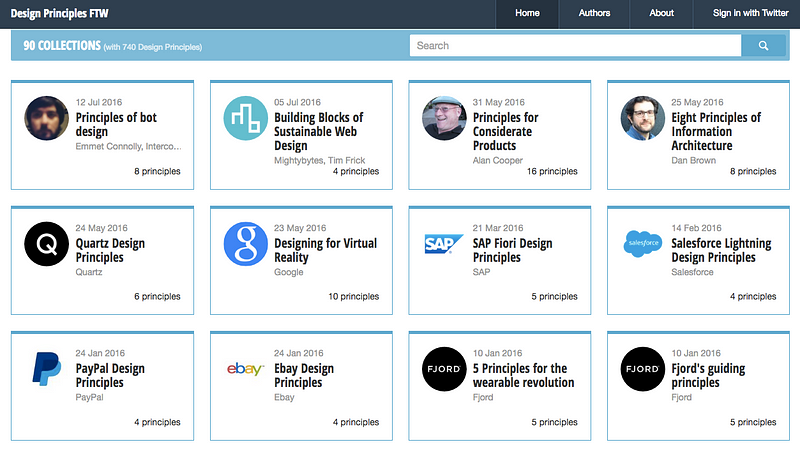
We came to the conclusion that we need to create a set of design principles. I set up a design team meeting and required everyone to present their ideas. I recommended a website called Design Principles FTW for inspirations. You can look up design principles from a list of companies, such as Google, Facebook, Apple.
Define Design Principles
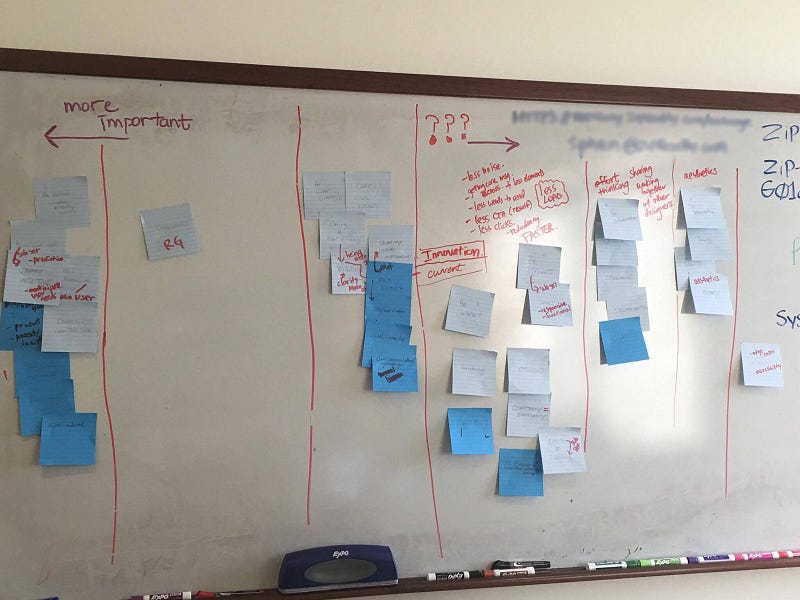
We generated solid design principle ideas from the presentation. We needed to go deeper and define what they are. I set up a second meeting and asked everyone to write down their principles on sticky notes. Then we all put them up on the wall to group them and rank the importance.
Maslow’s hierarchy of needs
As we started to figure out what the design principles should be, we needed a better way to visualize them. Back in June, I wrote a Lyft redesign article and talked about their design principles. They used a pyramid shape ( Maslow’s hierarchy of needs) define the importance of order. It inspired me and I decided to give that a try.
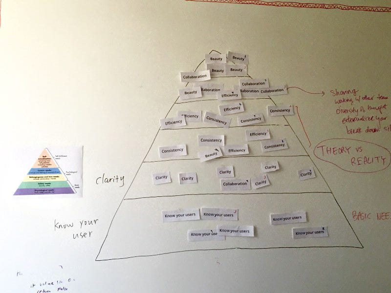
I printed out the design principles we created and cut them into pieces. I drew a giant pyramid on the white board and put a sample of Maslow’s hierarchy of needs next to it. Each of us got a set of principles and put them into the pyramid based on the way we wanted to rank them.
Oops, conflicts occur
We realized there were a few conflicts. We can’t decide which is more important, consistency or efficiency? We had a long discussion. At the end, we decided to group consistency and efficiency together. The reason is that it often differs depending on what project you work on and where you are during the process. For example, our engineers prefer consistency because they already built an style library. As designers, we have empathy for our users because of the extra number of clicks they have to go through. We want retention! We want to attract existing users of competitor’s product to our product! We know some legacy patterns are stopping us from accomplish it. Why not explore options that can actually help them run their business more efficiently? What if there is a need to prioritize efficiency over consistency for a specific case?

Here is something I learned from design events:
Don’t be afraid of creating new patterns if specific legacy patterns aren’t working well. Communicate with the engineers and product managers, help them understand the special needs. Hopefully, that way you can get your new design patterns into the next sprint.
Finalize Design Principles
We were so excited! Then, we paused. “Collaboration” exists in every step, we should take it from the pyramid. Beauty is an effective word, but why don’t we make it sound more artistic and fancier?
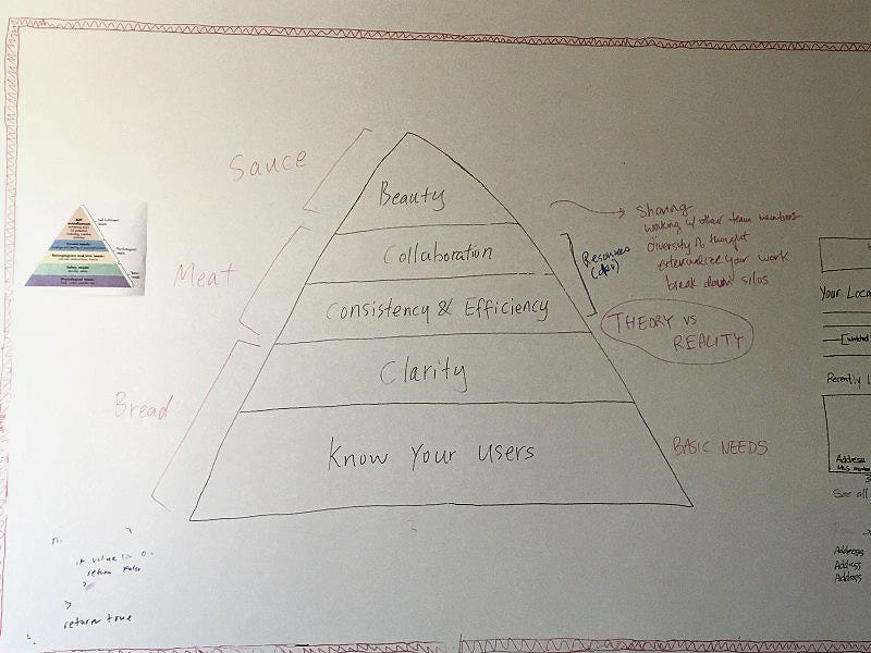
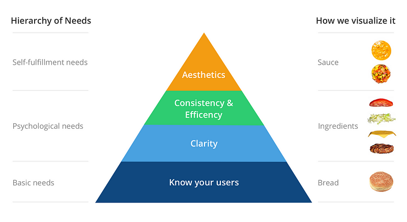
We had an idea to visualize the pyramid with pictures of examples next to it. I thought about how burgers are made, with bread, meat and sauce. I tried a few ideas and decided that meat is too specific. I replace “Meat” with “Ingredients”, as it’s more broad and presents psychological needs better.
Here is what we ended up with:
- Know your user = Bread (Basic needs)
- Clarity + Consistency & Efficiency= Ingredients (Psychological needs)
- Aesthetics = Sauce (Self-fulfillment needs)
Design Principles
Here is a diagram I created. The concept should be self-explanatory and visualizes the importance of each principle.
Definition:
Know your users
- Understand user needs. Understand what their needs are before being able to deliver the right solution. Know your users by understanding their goals and frustrations through interviews.
- Show empathy by adapting to user needs. Be aware of user needs and actual behavior. Manage your user’s expectations and understand that you are not your user.
Clarity
- Clarity is all about the relationships between elements. Consider the relationships between items on the page and structure the page based on importance.
- Create structure and hierarchy. Provide timely feedback that engenders confidence in the system. Users should know the consequence of each action they take.
Consistency
- Consistent interfaces. Allow users to develop usage patterns. Use standard controls and gestures consistently so that they behave the way people expect.
- Consistent language. Use the same term when referring to a particular action or object, and communication pieces to avoid confusion.
- Consistent use of established patterns. Users look for patterns they already know to shorten the learning curve and understand new experiences across programs.
Efficiency
- User experience is seamless. It works across various screen sizes, platforms, and products. Efficiency matters when people are likely to use the app a lot and they are prepared to spend time learning it.
- Efficient systems respect your time. Efficiency reflects the drive to get users to their goal by designing the shortest amount of time/number of clicks on task.
- Leverage technology to drive efficiency. Use technology to adapt to existing behavior instead of making users adapt to computers.
Aesthetics
- First impressions matter. A system that looks beautiful can further engender confidence and trust in the system
- Aesthetics is a quality that people recognize, want and need. It’s seenin design also in life, it makes the use of that interface enjoyable.
- Delightful. Your customers will look forward to using your product when it is pleasant to use.
Importance
Recently I listened to a Podcast by Julie Zhuo, the VP of product design at Facebook. She talked about how crucial is it for a startup to establish a clear set of design principles early. Her insights boost my confidence believing our principles will make our products better.
A lot of the purpose of having design principles is to really align people around what matters.
A good set of principles encodes that so everyone can have this shared sense of what’s important for us and what’s true to us. When new people join or when your company’s scaling, then it becomes easier for them to understand those things that are so unique and so important about the way that you do things and what you value.
We care about simplicity, and we care about people. When push comes to shove and you have to make a trade off, how are you, in those moments, as a team or a company going to prioritize? What are you going to care about the most?
Jessie Chen